康健國際醫療集團有限公司 Town Health International Medical Group Limited
Rebrand with a logo redesign & brand identity
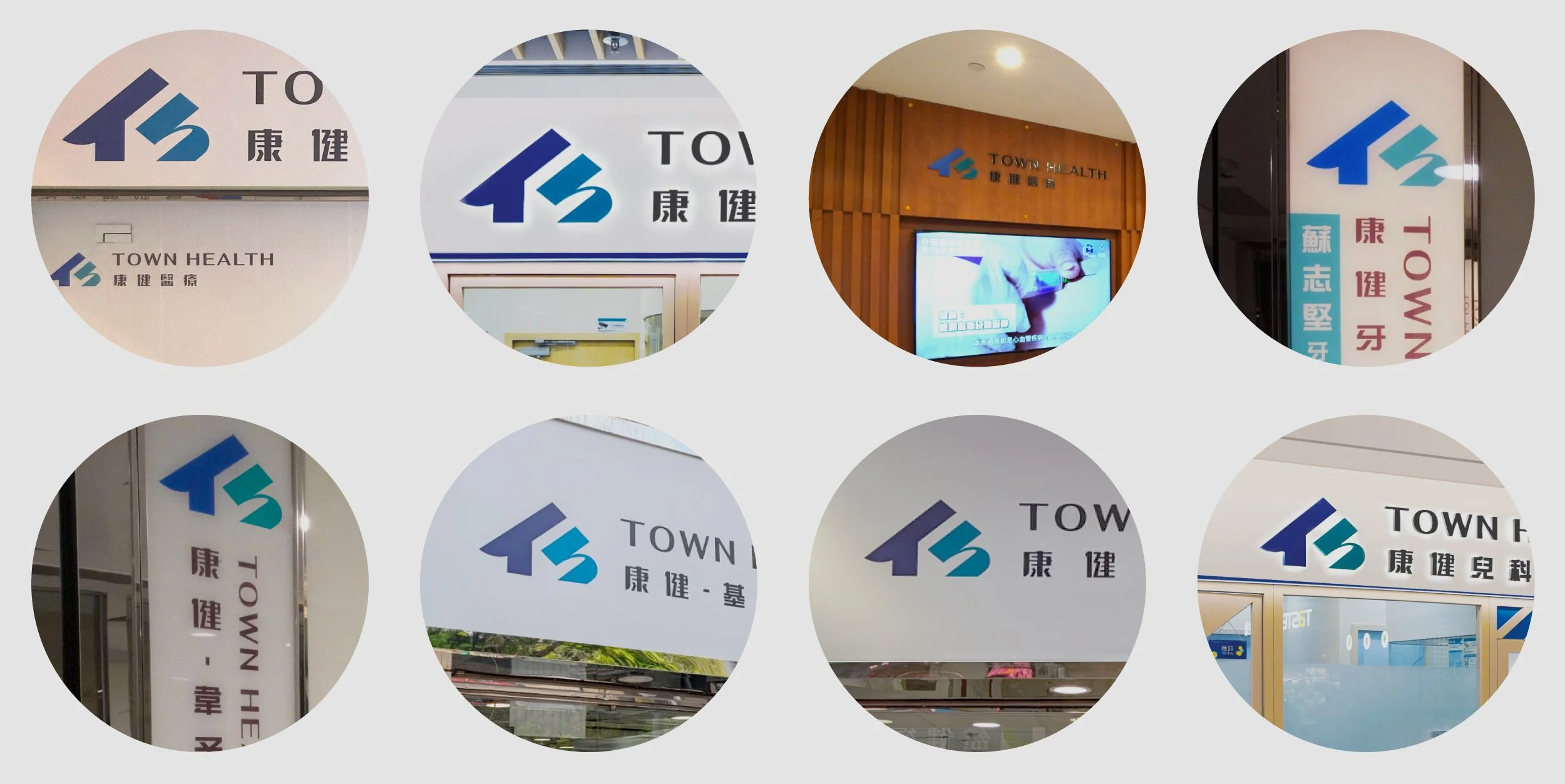
We are fortunate to redesign the logo for a local healthcare group with over thirty years of history. Our design concept features a simple house shape, incorporating the letters "T" and "h" to form the Chinese character "仁" (Ren), which symbolizes the benevolence of healthcare providers. The design embodies the concepts of "thoughtfulness" and "responsibility," effectively conveying the company's positioning as your family doctor, dedicated to safeguarding the health of you and your family. The group provides comprehensive, considerate general and specialized medical services, dental care, auxiliary healthcare, and other wellness services, earning the trust of the community as a reliable health partner. In addition to the logo design, we also created business cards, envelopes, letterheads, and developed brand usage guidelines.
我們有幸為本地一所三十餘年歴史的康健醫療集團重新設計商標。我們的設計意念是一個簡潔的屋形,當中隱藏字母「T」 和 「h」,共組而成漢字「仁」,醫者仁心、仁心仁術,以「貼心」和「責任感」作為設計理念,更好地傳遞企業定位——你的家庭醫生,守護你和你的家人健康 : 每天都為市民提供完善、體貼的普通科及專科醫療、牙科、輔助醫療及其他保健服務,深得市民信賴的健康伙伴。除了商標設計之外,我們亦為客戶設計名片、信封、信紙及製定了商標使用指導方針。


